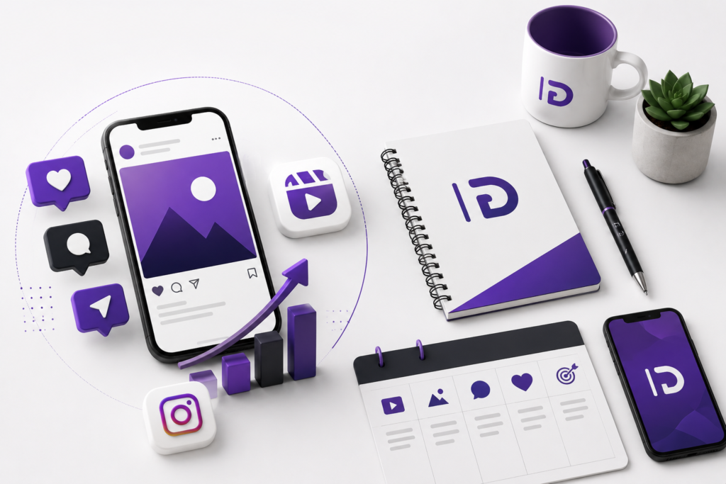



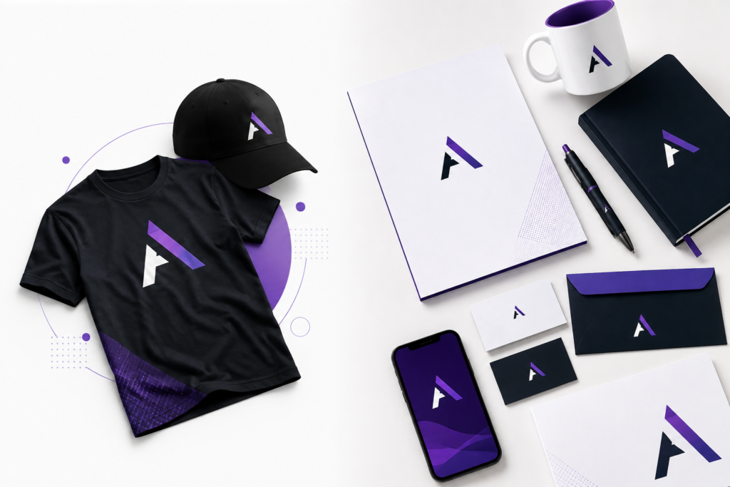
A customer opens your website.
Then they visit your Instagram page.
Later, they receive your company profile, see one of your advertisements, or pick up your business card.
Do all of those things feel like they came from the same business?
That is where the difference between having a logo and having a real brand identity becomes obvious.
Many businesses invest in a logo and assume their branding is finished. They receive a PNG, place it at the top of their website, add it to their social media profile, and move on.
But a logo alone doesn’t tell you what your website should look like.
It doesn’t establish your typography.
It doesn’t determine how your social media graphics should be designed.
It doesn’t define your photography, colors, brochures, presentations, packaging, uniforms, or marketing materials.
And it certainly doesn’t create consistency by itself.
A logo is important—but it is only one component of a much larger brand system. Adobe similarly describes a logo as a visual identifier rather than the entire brand, with the wider identity potentially including colors, fonts, photography, voice, layout patterns, and other decisions.
So if you’re starting a company, refreshing an existing business, or trying to make your organization look more professional, what do you actually need?
Let’s break it down.
What Is a Logo?
A logo is a recognizable visual mark representing your business.
Depending on the brand, it might be a:
- Wordmark
- Symbol
- Monogram
- Lettermark
- Combination mark
- Emblem
- Custom typographic treatment
Its primary job is identification.
Think about seeing a company’s symbol on an app icon, storefront, product, uniform, advertisement, or social profile. A successful logo helps you quickly connect that visual element with the organization behind it.
That makes the logo extremely valuable.
But it doesn’t make the logo the entire brand.
Think of your logo as your signature.
Your signature identifies you.
It doesn’t explain your complete personality, communication style, appearance, values, or reputation.
A business logo works similarly.
It gives your company a visual identifier that can repeatedly appear across different environments.
Your brand identity determines what happens around that identifier.
What Is Brand Identity?
Brand identity is the broader system businesses use to create a recognizable and consistent presence.
Adobe describes brand identity as going beyond products and logos and connecting a company’s visual appearance with its brand promise. Common visual assets include logos, color schemes, typography, iconography, photography, and graphics.
A professional identity might therefore include:
Logo system
Primary logo, secondary logo, icon, monochrome versions and different configurations.
Color system
Primary colors, secondary colors, accent colors and rules governing their use.
Typography
Fonts and typographic hierarchy for headings, body copy, buttons, documents and marketing materials.
Graphic language
Shapes, patterns, lines, illustrations, icons and other recurring visual elements.
Photography direction
How imagery should look, including composition, lighting, treatment and overall mood.
Brand voice
How the business communicates through headlines, advertisements, websites and other content.
Layout system
How different elements are arranged so designs remain recognizable even when the content changes.
Brand applications
How everything comes together across actual customer touchpoints.
The important word here is system.
Strong branding isn’t a collection of unrelated attractive designs.
Everything works together.
Logo vs Brand Identity: What’s the Difference?
Here’s a simple comparison.
| Logo | Brand Identity |
|---|---|
| Identifies the business | Creates the complete recognizable experience |
| One visual asset/system | Multiple coordinated brand elements |
| Includes a mark, wordmark or symbol | Includes logo, color, typography, imagery, layouts and more |
| Appears within designs | Determines how those designs should look |
| Answers “Who is this?” | Answers “Who is this and how should they consistently appear?” |
| Part of the identity | The broader system |
This distinction matters because businesses don’t interact with customers through their logo alone.
Customers experience your company through your website, advertisements, social media, documents, emails, packaging, sales presentations, physical spaces and dozens of smaller interactions.
Your identity connects those interactions visually.
A Simple Example
Imagine you start a premium construction company.
You commission an excellent logo.
It uses sophisticated typography and feels established and professional.
Then you:
- Build a website using completely different fonts.
- Choose random colors for your social media graphics.
- Create a bright flyer that doesn’t resemble your website.
- Send proposals using generic Word templates.
- Print business cards using another font.
- Put the logo on employee shirts without consistent placement.
- Create advertisements using whatever design looks good that week.
You technically have a professional logo.
But you don’t have a professional brand experience.
Now imagine the alternative.
Your website, proposals, uniforms, vehicles, advertisements, company profile, social media graphics and business cards all use the same underlying visual language.
A potential customer starts recognizing your company before they even consciously look for the logo.
That’s what a strong identity system is trying to achieve.
What Does a Complete Brand Identity Include?
There isn’t one universal branding package that every organization needs.
A local restaurant and a technology startup have different requirements.
A construction company may need vehicle graphics and uniforms.
An e-commerce company may care more about packaging.
A consulting company might prioritize presentations and corporate documents.
But a comprehensive identity commonly includes several layers.
1. Primary Logo
This is the main representation of your company.
It will typically appear on your:
- Website
- Company profile
- Business cards
- Signage
- Marketing
- Documents
The primary logo should work reliably across its intended applications.
2. Secondary Logo
Sometimes the primary logo doesn’t fit.
A wide horizontal logo may look excellent in a website header but terrible inside a square social profile image.
That’s why professional identities often include alternative configurations.
You might have:
Primary logo: full horizontal version
Secondary logo: stacked version
Brand mark: standalone symbol
Favicon: simplified digital version
These aren’t different brands.
They’re different tools within the same system.
3. Color Palette
Choosing “blue” isn’t really a color system.
A proper palette establishes specific colors and how they work together.
For example:
Primary color — dominant brand color
Secondary color — supporting visual color
Accent color — used strategically for emphasis
Neutral palette — backgrounds, text and interface elements
Defined values can then be documented for appropriate digital and print use.
Without those standards, the same company can slowly become five slightly different versions of itself.
4. Typography System
Typography is one of the most underestimated parts of branding.
Your business might have excellent colors and a great logo, but inconsistent typography can still make everything feel disconnected.
A typography system can establish styles for:
- Major headlines
- Section headings
- Subheadings
- Body text
- Captions
- Buttons
- Documents
- Presentations
Adobe notes that typefaces are an integral part of an overall identity and recommends establishing appropriate typography for headline/display and body-copy use.
This is especially important once multiple designers, marketers or employees begin creating materials.
5. Graphic Elements
This is where branding becomes much more interesting.
Your logo doesn’t need to appear enormous on every design for people to recognize your business.
Instead, an identity can develop its own visual vocabulary using:
- Shapes
- Lines
- Patterns
- Icons
- Gradients
- Frames
- Textures
- Illustrations
- Background systems
These elements can become recognizable assets themselves.
This is how you move from:
“Put our logo on it.”
to:
“Make this look like our brand.”
That is a major difference.
6. Photography and Image Direction
Even photography can be part of an identity.
Imagine one company consistently using clean, bright architectural photography while another uses dark, dramatic, high-contrast imagery.
Over time, those approaches become part of how each company feels.
Your guidelines might establish:
- Lighting
- Composition
- Backgrounds
- Subject positioning
- Cropping
- Image treatment
- Filters
- Product photography
- People photography
Adobe specifically recommends consistent palettes, lighting, composition, framing, and visual tone when businesses want photography to reinforce brand recognition.
7. Iconography
Icons seem minor until your company starts producing:
- Websites
- Apps
- Presentations
- Brochures
- Infographics
- Social media posts
- Reports
Using completely different icon styles everywhere creates visual noise.
A brand system can establish whether icons should be:
- Outlined
- Filled
- Rounded
- Geometric
- Minimal
- Detailed
- Monochrome
- Multicolor
Small decisions create big consistency when repeated hundreds of times.
8. Brand Voice and Messaging
Branding isn’t exclusively visual.
Consider these two headlines:
Powerful solutions engineered for enterprise growth.
and:
Big ideas. Less complexity. Let’s grow.
They could describe similar services.
But they sound like completely different companies.
Your brand voice helps establish how your organization communicates.
It might be:
Professional and authoritative
Friendly and conversational
Bold and disruptive
Minimal and sophisticated
Technical and precise
Playful and energetic
Canva’s current brand-consistency guidance similarly identifies voice, tone, messaging and communication alongside visual identity as important elements of consistent branding.
9. Company Profile
For many B2B businesses, this is one of the most important applications of the identity.
A company profile may be sent to:
- Prospective customers
- Investors
- Government organizations
- Partners
- Vendors
- Procurement teams
A professionally branded profile can include:
- Company overview
- Mission
- Vision
- Services
- Products
- Experience
- Leadership
- Projects
- Clients
- Certifications
- Contact information
It should feel like an extension of the company—not a completely separate PDF somebody designed later.
10. Business Cards and Stationery
Digital-first doesn’t mean physical branding has disappeared.
Depending on your business, you may still need:
- Business cards
- Letterheads
- Envelopes
- Folders
- Invoice templates
- Proposal templates
- Email signatures
- ID cards
Again, these should belong to the same visual family.
11. Brochures and Flyers
Your marketing collateral is where a flexible identity starts proving its value.
Instead of inventing a completely new design every time your business launches a campaign, designers can work from an established visual system.
The content changes.
The brand remains recognizable.
12. Social Media Identity
This is especially important in 2027 because many potential customers will encounter a business on social media before exploring the rest of its presence.
Your social identity might establish templates for:
- Instagram posts
- Stories
- Reels covers
- LinkedIn graphics
- Facebook posts
- TikTok covers
- Announcements
- Testimonials
- Promotional campaigns
Consistency doesn’t mean every post should look identical.
It means they should feel like they belong to the same organization.
13. Branded Merchandise
This is where a well-built identity can become physical.
Depending on your company, branding might extend to:
T-shirts
Polo shirts
Hoodies
Caps
Cups
Mugs
Pens
Notebooks
Bags
Lanyards
Employee uniforms
Event merchandise
Packaging
Boxes
Stickers
Signage
Vehicle graphics
The challenge isn’t simply placing your logo on everything.
Good branded merchandise considers placement, scale, color, material and the overall visual system.
A tiny pen and the back of a large T-shirt obviously require different design decisions.
Your identity should be flexible enough to handle both.
What Are Brand Guidelines?
Once all these elements exist, someone needs to explain how to use them.
That’s where brand guidelines come in.
Think of your brand guidelines as the operating manual for your identity.
They can document:
- Logo variations
- Logo clear space
- Minimum logo sizes
- Incorrect logo usage
- Brand colors
- Typography
- Graphic elements
- Photography
- Iconography
- Layout principles
- Brand voice
- Examples of applications
Adobe describes a brand guide as a blueprint for consistent branding, covering elements such as typeface formatting, logo variations, image rules, color palettes, illustrations and icons, with broader guides potentially covering voice and messaging too.
That becomes increasingly valuable as your company grows.
Why Does Brand Consistency Matter?
Because recognition is built through repetition.
Imagine seeing a company today with:
- Purple website
- Blue brochure
- Red Instagram templates
- Three different fonts
- Different logo variations
- Completely different advertising styles
You have to mentally rediscover the company every time.
Consistency reduces that friction.
Your website looks like your advertisement.
Your advertisement looks like your social media.
Your social media looks like your proposal.
Your proposal looks like your company profile.
And eventually the customer thinks:
“I know this company.”
Current guidance from Canva emphasizes consistency across websites, promotional emails, social channels and advertising, and points to recognition, trust and loyalty as key benefits.
Does Consistency Mean Every Design Should Look the Same?
No.
This is an important distinction.
Consistency does not mean copying the same layout forever.
That’s repetition, not necessarily good branding.
A strong system should give designers enough rules to maintain recognition while leaving enough flexibility to create something appropriate for each situation.
Think of it like a language.
You don’t repeat the same sentence every day.
You use the same language to communicate thousands of different ideas.
A mature identity works similarly.
Does a Small Business Really Need Full Branding?
Not every small business needs a 100-page brand manual.
But nearly every serious business benefits from establishing the fundamentals.
At minimum, consider defining:
- Logo
- Logo variations
- Color palette
- Typography
- Basic graphic style
- Photography direction
- Basic usage guidelines
Adobe’s small-business guidance likewise recommends considering brand identity early because it creates a foundation for subsequent marketing.
The level of sophistication should match the business.
A one-person local service company doesn’t necessarily need the same system as an international organization.
But both benefit from looking consistent.
When Is Just a Logo Enough?
There are situations where starting with a logo makes sense.
For example, you may be:
- Testing a new business idea.
- Running a temporary project.
- Creating a small internal initiative.
- Working with an extremely limited launch budget.
- Not yet producing substantial marketing materials.
In these situations, getting a strong logo and a few basic colors may be enough initially.
But understand what you’re purchasing.
You’re buying an identifier, not necessarily a complete identity.
As the business grows, you’ll probably need to develop the rest.
When Do You Need a Complete Brand Identity?
Consider investing in a more complete identity when:
You’re launching a serious new business.
Starting with a system makes it easier to keep everything consistent from day one.
Your existing branding looks inconsistent.
Your website, social media, documents and marketing shouldn’t feel like different companies.
You’re repositioning the business.
If your target market, pricing or services have changed substantially, your identity may no longer represent where you’re going.
You’re moving into a premium market.
Presentation matters more when customers are being asked to make a larger commitment.
Your team is growing.
The more people creating materials, the more important guidelines become.
You’re expanding your marketing.
Advertising, content, events, brochures and social media create more opportunities for inconsistency.
People don’t remember your business.
Recognition problems aren’t always logo problems.
Sometimes the business simply lacks a repeatable visual language.
Logo Design vs Brand Identity Cost
Naturally, a logo should usually cost less than developing an entire identity system.
Why?
Because the scope is different.
A logo project may involve:
Research → concepts → refinement → final logo → exports
A comprehensive identity might involve:
Discovery → research → positioning → creative direction → logo system → colors → typography → visual language → applications → guidelines → final asset library
The number of deliverables isn’t the only difference.
The amount of strategic thinking and system design is substantially greater.
So when comparing branding quotations, don’t compare prices until you compare scope.
One designer may be quoting for a logo.
Another agency may be quoting for an entire brand system.
Those are not equivalent products.
What Professional Branding Should Look Like in 2027
Good branding in 2027 shouldn’t simply mean following whatever visual trend is popular this year.
Your business needs something more durable.
We believe strong contemporary identities should generally prioritize five qualities.
1. Recognizable
Someone should gradually learn your visual language.
2. Flexible
The identity needs to work from a tiny favicon to a large exhibition wall.
3. Digital-Ready
Your brand will appear across websites, mobile interfaces, social media, advertisements and video.
Design accordingly.
4. Systematic
Don’t rely on one beautiful logo to do all the work.
Develop supporting elements.
5. Scalable
Your brand should still function when more designers, employees, agencies and partners begin using it.
This is exactly why documented guidelines and centralized brand assets become increasingly useful as teams scale.
Common Branding Mistakes Businesses Make
Mistake #1: Thinking the logo is the brand
It’s an important asset—not the entire system.
Mistake #2: Choosing colors without rules
A palette needs hierarchy and purpose.
Mistake #3: Using too many fonts
Typography should reinforce recognition rather than constantly change.
Mistake #4: Copying competitors
Looking professional doesn’t require looking identical to everyone in your industry.
Mistake #5: Following trends too aggressively
Today’s fashionable effect can become tomorrow’s obvious redesign.
Mistake #6: Designing every marketing asset independently
Your brochure, website and social posts shouldn’t restart the creative process from zero.
Mistake #7: Having no brand guidelines
Without documentation, consistency becomes dependent on memory.
Mistake #8: Making the logo do everything
A good identity can often be recognizable even when the logo isn’t dominating the design.
How DodoFlow Approaches Brand Identity
At DodoFlow, we don’t think branding should stop at making a logo look attractive.
The objective is to create a visual system that your business can actually use.
Depending on the project, that can mean developing the core identity and then showing how it translates into real-world applications such as:
- Logo systems
- Color palettes
- Typography
- Company profiles
- Business cards
- Brochures
- Flyers
- Social media
- Presentations
- Stationery
- T-shirts
- Cups
- Pens
- Merchandise
- Packaging
- Other branded materials
The result should make it easier—not harder—to maintain a recognizable business as you grow.
Because the goal isn’t:
“We have a nice logo.”
The better goal is:
“People know it’s us before they even need to look at the logo.”
Frequently Asked Questions
Is a logo the same as a brand identity?
No. A logo is a visual identifier for your business. Brand identity is the broader system that can include your logo, colors, typography, imagery, graphic elements, voice and rules for applying them consistently.
Do I need a brand identity if I already have a logo?
Possibly. If you already have a strong logo but your website, social media, documents and marketing materials look inconsistent, you may be able to build an identity system around the existing logo rather than replacing it.
Can I create the logo first and branding later?
Yes. Many businesses evolve this way. However, developing the system together can make it easier to ensure the logo works naturally with the rest of the identity.
What should a basic brand identity include?
For many small businesses, a useful foundation includes a primary logo, alternative logo versions, color palette, typography, graphic direction and basic brand guidelines.
What is the difference between brand identity and brand guidelines?
Brand identity is the actual system representing the business. Brand guidelines explain how that system should be used. Adobe makes the same distinction: identity represents the company’s core and informs visual expression, while guidelines establish rules for expressing that identity across channels.
Do I need a company profile as part of my branding?
Not every business does, but company profiles can be especially valuable for B2B organizations, contractors, agencies, consultancies and companies regularly presenting themselves to potential partners or clients.
Should my website match my branding?
Absolutely. Your website is one of your most important brand touchpoints. Colors, typography, imagery, messaging and interface details should feel connected to the rest of your identity.
How often should a business rebrand?
There isn’t a universal schedule. Rebranding should normally solve a business or positioning problem—not happen simply because another visual trend has appeared.
Your Business Needs More Than Something That Looks Good
A beautiful logo is valuable.
But imagine something more powerful:
A customer sees your advertisement without noticing the logo and recognizes your company.
They open your website and immediately experience the same visual language.
They download your company profile and it feels connected.
They see your booth at an event and recognize it from across the room.
They receive a branded package and know who sent it before reading the name.
That’s what an identity system can achieve.
A logo gives your business a mark.
A brand identity gives that mark a world to live in.
And when that world is designed consistently, your business becomes much easier to recognize.
Ready to Build a Brand People Recognize?
Whether you’re launching a new company or your current branding no longer represents the business you’ve become, DodoFlow can help you build a cohesive visual identity designed for real-world use.
From your logo and visual system to company profiles, brochures, social media, print and branded materials, everything should feel like it belongs to one company.
Make the business recognizable.
Build your brand with DodoFlow.